Website redesign and the future
At the beginning of this year I came back to freelancing after a 2 year stint working in a neuroscience tech startup. My website was hella’ old, I can’t even remember exactly… 5, maybe even 8 years?! When you are freelancing, your work often comes from word of mouth. If you’re busy and things are ticking along your portfolio site can really take a back seat. Turns out my site took a back seat for half a decade.
I’m no longer on the first page of google and my site was looking a little crusty. On top of this there’s been a uptick in the number of freelance web developers in my area, so I have fallen behind. Time to fix that! I wanted to differentiate myself, both in quality of work and in personality.
Web Developer Portfolios
There is something of a look to your professional web developers site. Nothing wrong with it, but I guess ‘safe’ would be the word? It’s more functional than ‘wow, that looks great.’ Then you have porfolios of creative developers where the site is pretty out there – but often to the detriment of usability. I wanted to walk that fine line between the two. Something professional, but also interesting with some of my personality showing.
Having worked with a larger team and lots of designers for the past couple of years I’ve really narrowed down what it is that I am good at – and that’s high quality front-end and going the extra mile to match designs and understand design. I have the technical and problem solving skills to flesh out tangible ideas, but also really care about the execution of those ideas and ultimately, it looking and feeling good. I also love animation and interactivity so I wanted to do something that in some way showcased these skills without being totally off the wall.
Table Top Board Games
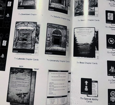
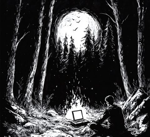
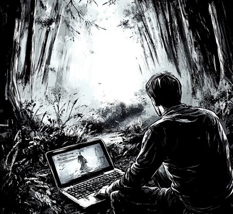
I’ve been playing the themeborne board games a lot recently, ‘Escape the Dark Sector‘ and their Last of Us game ‘The Last of Us: Escape the Dark“. These games are gorgeous, all black and white with beautiful illustrations and dripping in atmosphere. The game mechanics are great, but the whole package, the way everything ties in together is just chefs kiss. As a developer and just general lover of good design I loved the tightness the black and white constraints produced… so I thought I’d steal that idea for my site.
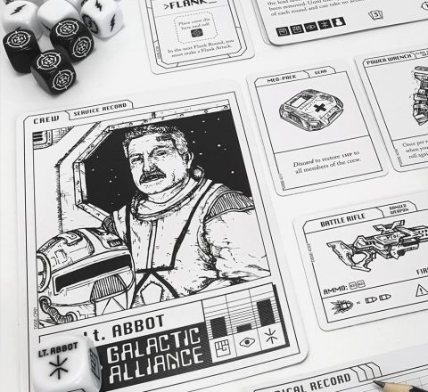
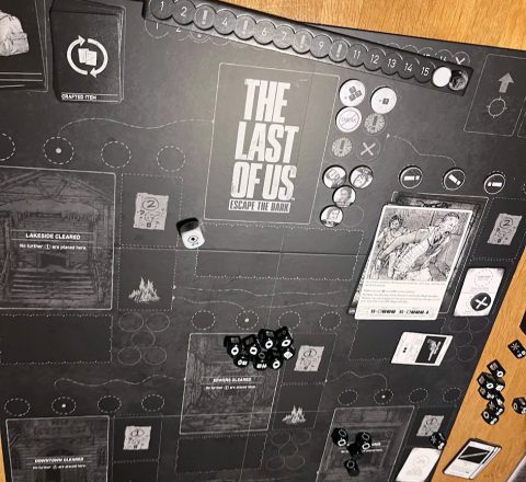
Unfortunately for me, the artwork of these games relies heavily on some excellent hand drawn illustrations. I like to draw, but I’m a mediocore at best and knew it would be far too time consuming and not good enough if I attempted the art myself. Instead I turned to AI.
I know, I know. The elephant in the room. I’m very conflicted about AI art and I have good friends that are illustrators, but still, I wanted to give it a shot and see if a certain quality bar could be reached.
AI and the future
A big thing in the development world (and the world in general) is obviously AI. I’ve been tinkering with it for a while, but it’s now caused something of a sea change. There is a genuine fear of job losses and a shrinking of the market, but AI is clearly not going away anytime soon.
If AI can write code and produce art, then what’s the point in a developer or a designer? Well, can AI do all that by itself? Or does it need someone to curate these ideas who knows if they are worth anything? I can only hope that the latter is true!
As a developer of 15 something years I’m no stranger to learning new things. You’ve always gotta be keeping up with the times, learning new tools, new languages. AI is no different?
Either way, I took this as an opportunity to retool, brush up skills and get up to date the latest web dev techniques, including AI.
I’ve upgraded my text editor to Cursor, which comes with Claude AI baked in. It’s crazy how far things have come and how fast, and it’s clear to see how this stuff is game changing for productivity.
I’d also been playing around with AI art generation in Midjourney. With all this in mind I set about redesigning my site.
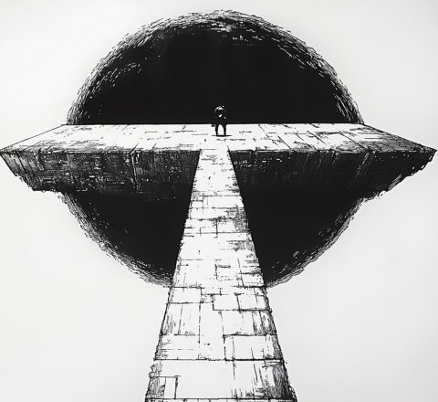
AI Dystopian Art
Getting something half decent out of Midjourney is relatively easy, but getting something cohesive across a range of images is a lot trickier. I think it really helped having a strict style in mind (black and white ink, hand drawn looking).
Still, it proved tricky. Originally I wanted to go down the Last of Us theme more. The majority of Bristol design agencies and freelancers are on a real ‘design for positive change’ tip at the moment. I’m pleased that people retain their optimism in these interesting times, but I don’t feel there is much I can add to that well- trodden ground.
I wanted to take a slight risk and stand out a bit more. It almost became a bit of joke that if everyone else if trying to save the world and be nice should I be doing the opposite? I’m not that much of a contrarian that I’ll do anything just to stand out, but this combined with my love of the themeborne aesthetic and atmosphere were leading me towards something dystopian!
It played into the freelance angle too and my sense of pragmatism. Developer survival in a cold dark world.
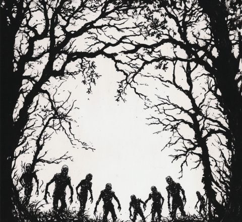
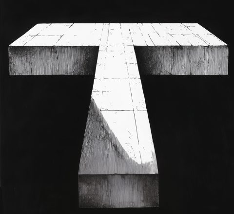
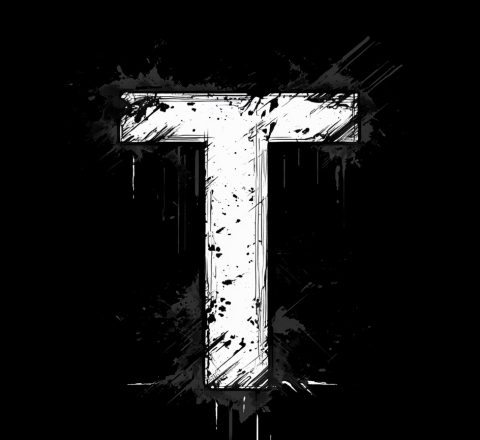
In the end this route felt a bit too gimmicky (as possible gloomy!) and it was very hard to get consistent AI art with this theme. Too many zombies, too on the nose. With some experimentation and tweaking I went where the AI art took me, and that was this brutalist ‘T’ monolith. It had a gritty ‘sci-fi aesthetic that had the right about of doom for my sensibilities but with some light and shade. More of a sense of adventure, and the future (obviously).
Science Fiction
So AI led me in the direction science fiction. I love me some Sci-fi. Films, books, anime, board games, video games – I’ll take it in any medium, so this was a good fit. This in turn helped dictate some of the animation. I liked the idea of retro futurism and ‘Cassette Futurism’ – sort of a 70s sci-fi, CRT screens and analogue tape feel. A little dose of that combined with your more serious Interstellar and Dune-esque aesthetics and I ended up here.
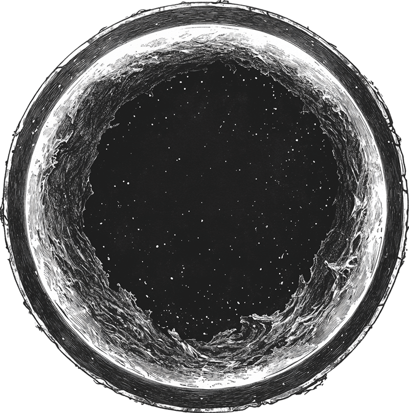
I am in the middle of reading a book on white holes (as you do) and this coincided with me playing around with SVG filters to create this vortex style effect on the homepage. It made sense to have a light and dark mode to match the black and white holes.
The brutalist T is obviously reflects my common as much name, but more broadly represents my skills in a T shape with your breadth of knowledge going across and then some specialist knowledge deep knowledge going down.
Something Cohesive
I’m sure these levels of meaning are lost to all but me, but heh, I’m really happy with the results and that the design reflects some of my tastes. Hopefully it balances this with looking professional and enough broad appeal that it doesn’t alienate (I went there) anyone.
As well as trying to do something a bit more personal, it was a fun exercise in using AI tools to try and create something a little different, but still a solid and cohesive idea.